Interaction - Interactive Design 112, Part A
Themes...
Pirate Maps:
This is not as such a pirate map where "x marks the spot" but does show how the general idea of a map where ships are situated, etc...
Also the idea that when there were lots of bands of pirates ages ago there was not such a thing as a GPS nor electronics and so compasses were used to navigate both land and sea.
Pirate Maps 2.0:
This might look familiar as it is the Neverland Island map. Anyway as a pirate map it indicates where what is and also with the use of a compass for navigation. It also gives off the authentic coffee stained look which makes it look worn and torn as it must have been used many times.
To conclude my pirate theme I had the idea of using a compass instead of arrows and making it look authentic like map 2.0 as well as technical like the first map.
Underwater:
For those who prefer something more tranquil I wanted to add in a underwater theme. Just because we are above land does not mean we can also explore underwater. For this theme I want to highlight the colours that are seen underwater and use those colour for this themes colour combination. These colours will mainly be blue, purple and pink.
Underwater 2.0:
Just another idea for the underwater theme. I had the idea that different creatures and plants could represent different thing on the map to make it more enjoyable to follow.
The underwater theme could be a fun for both guys and girls as it is not gender specific.
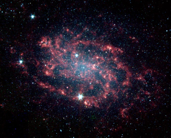
Space Age:
For another theme I thought of space. Seeing as space is so humongous I could so much with the theme. I could use a star instead of an x and use galaxies (clumped stars) as the path that should be followed to your destination. I could also use a little mini spaceship to indicate where you are on the map and different coloured ones to indicate where your friends are on campus.
Space Age 2.0:
I was also thinking that I could include the planets into the map as to show different things like the planet Uranus for the toilets and Saturn for cafes.
For the colour scheme for this theme I could use Yellow, Black and Dark blue.
Royalty:
The idea of royalty is prestige as shown in the image above with the intricate working of the design. Also the colours of silver and gold gives it that high quality feel to it. So for royalty as a theme the interface design would be intricate and delicate. For example the buttons linking to the next section would be banners and your destination could be a crown and to show where your are could be a diamond.
Royalty 2.0:
This pattern looks very prestige, like something you might see in some wealthy persons home. The colours of deep blue and gold suggests the idea royalty too. This would be a good pattern to have in the background of the interface, but saturated down to only be there but not to be seen.
Together these two image brings some quality to the theme choices as it is so different. The colours that I would use would be deep blue, gold and silver.


looking good :)
ReplyDeletenow you've got a solid idea and some interesting things to do with it it's really time to dive into flash. make sure that you can communicate your idea into a reality.