Kerning
Original Letters Rearranged:
In the first image we worked with san-serif and serif fonts to test out how different kerning spacings effects the different fonts. Starting out with very small kerning spacing between the letters at the top of the page and ending with bigger kerning spaces at the bottom of the page. The serif font looks best with medium kerning spaces, as it is the easiest to read. The san-serif font looks most effective with small kerning spaces, as it draws your eye in more and this makes it easier to read rather than having bigger gaps between the letters where nothing draws your attention to the next letter and so on.
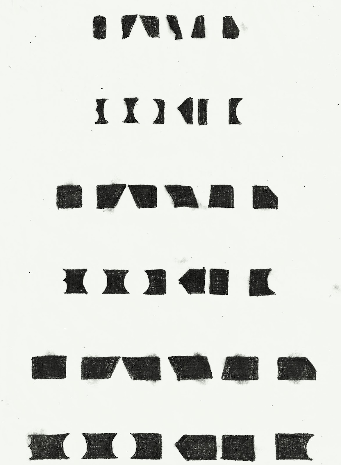
Hatching in Kerning Spaces:
Using tracing paper we hatched in the gaps between the letters to show the how kerning influences the way we perceive and read a word. The shape and width of a letter influences how far away the letters are from each other to create even kerning spaces, so that the word is easier to read.

No comments:
Post a Comment