Pages

Friday, August 24, 2012

Structure and Noise - Creative Coding 142

Final

Structure:

This is my structured composition as you can see. I wanted to work with circles since a circle is a very symmetrical shape as it revolves around a point making it a very structured shape compared to many other shapes. So I wanted to see what I could do to distort them and transform them into noise and into something unrecognisable to a circle. I added in a stroke to the circles that is the same as the fill, but not opacified like the fill of the circles. I decided on this blue from my inspiration image of a possible colour palate. This used this bold coloured stroke to make my circles pop out from the black background and not melt into it.

Structure + Little Noise:

I still kept the original layout of the repeating circles on the x and y axis, but added noise in the form of extra circles transformed by the random function to make ovals overtop the existing circles. Also if you look closely enough you can make out that although I have kept the existing layout I have also made the first layer of circles into wonky vertical and horizontal lines. Thus introducing noise into my composition.

Noise + Little Structure:

I added another ellipse to the mix to create an increase in the noise of the composition. I also made the random function for the last layer have a wider variation in the sizing of the ellipses. After I had done that it didn't seem like enough change had happened so I increased the wonkyness and the random function to change the variation in the widths and heights of the first layer. And this was the result. This I thought was a good composition for the second to last image as it showed more the noise of the ellipses but still a little but of structure was left in the composition (but not much).

Noise:

Finally there was no more structure left and all that is present are the curved lines of the ellipse overlapping each other left due to increasing the variation in sizing and layout (wonkyness). The composition that I had stated with is no longer present at all which is what I wanted to achieve. The overlapping ellipses that are all opacified down creates an aesthetically pleasing composition due the different variations of blue that the layering has caused. Also the thin stroke enhances the aesthetics to create a messy yet artistic look about it. This is so contrasted against the boring structured look of the first composition.

Final Assembly of all 4 Compositions:


In the assembly of all four compositions you can notice the transformation taking place from a very structured composed image to a very loud and noisy composition. Along with this transformation you can see a gradual inclination of a gradient taking place. To make my transformation effective I made my structured image very unoriginal where all you notice are the neatly formed rows of circles seems void of expression and is very organised whereas in the noisy image you can see that the ellipses have become disorganised, multiplied and grown into a composition full of expression and emotion to create a uniquely-vivid noisy composition. I am very pleased with my outcome and now can now understand the coding for looping a lot better than I did at the start where I was pretty much lost.

Structure and Noise - Creative Coding 142

Further Development

Combinations:

Here I increased the number of circles and added a random function to create noise. Because of the multiple circles and random function the circles are all positioned out randomly. To enhance the overlapping of circles I made them transparent and experimented using a purple colour palate. This I thought looked really nice, but the purple seemed to disappear into the background to much.

So I decided to add in a stroke from my previous experimentation and this made the circles/ovals stand out. I added in another random function to create various shaped ovals to enhance the noisiness of the image. However I still thought that the purple still blended in too much into the background and did not yet have the bold effect I was looking for.

Structure and Noise - Creative Coding 142

Developing Own Style

Using Ovals:

Here I experimented again with changing stroke but this time with ovals to see what would happen. I found that this made a way more interesting composition. It looks structured yet  quite noisy in the business way of the image.

Here I just used colour to see what it would look like. I made it a rainbow because I love rainbows. And to decide what colour would look better.


Here I just changed the code a little bit around and come out with this. I quite liked the middle as the layering created crosses.

Colour:

I found this in one of my old image folders and really liked this colour pallet, especially against the black/dark background. And the bright blue and purple I found stands out and pulls you into the image.

Structure and Noise - Creative Coding 142

Experimenting with Pattern Maker

Triangles:


I wanted to try out new shapes and thought triangles would make an interesting composition. I struggled to get the hang of looping, but by using pattern maker loops it made it easier to create repetition of shapes.

Using Random Function:


Here I used pattern maker for both circles and rectangles. Except for the rectangles I used the random function to change the widths and lengths. I kept the circles because I thought that the circles with the rectangles made a very structured and abstracted composition.

Overlapping Patterns:

Here I created my code so that all circles overlap each other. And so I experimented with stroke to see what happened when the opacified circles overlap each other.

Here I used a thin stroke. This made me think of a chain linked fence. Where the circles overlap it made a sort of criss-cross pattern and the sort of oval shapes create four leafed flowers making it quite aesthetic. 

Here I used a thicker stroke. I prefer the thicker stroke as it is bolder and louder. I found that the parts where the circles overlap made little pointy leafed flowers which I liked a lot and that it is darker.

To make my composition of circles more interesting I decided to add in squares. This gave it quite a  mosaic look about it. The thinner stroke enhanced this look whereas with a thicker stroke...

... made a really awesome pattern, almost like wall paper. The opacity makes the true green colour come through more and creates an aesthetic layering.

Monday, August 20, 2012

Interaction With Object - Interactive Design 112

The Interaction with my Object...

I designed my object into a box so that someone's first impression of the box wont be much as well as choosing black to make it more inconspicuous and darken the inside. Yet my box holds many experiences. It is something small yet not big so that it is a good size to just pick up and hold in your hands. After testing my object with a few people they all look inside first which was what I intended for due to my main sense being vision/sight. Then I found that they would either put it to their ear and shake it slightly or they would stick one finger in the hole to see what it actually is.

The Experience:

Sight;

Looking from afar.

Looking in closely.

Listen;


Touch;


The Object:

Outside;

The form and showing the hierarchy point which is the hole that is the point where most of the interaction with the object takes place.

Inside;

What is hidden inside the box. I also placed a mirror at the back for depth. I found that when you look from afar you see what is inside, but when you look in close I found that you look past the strings and into the mirror thus creating an illusion in itself (reference to earlier exploration into pictures and images).

200 Word Description:

My object relates to the sense of vision/sight but also to the sense of touch and sound. I made my object into a plain cubed box as to maximise the experience as it is what is inside the box that counts most. I also made my object a good size that makes it comfortable to pick up and play around with in your hands. My object creates a unique experience for its users through invoking these senses. Through sight the object creates a unique experience for something that you would not have guessed to see or experience in such a small enclosed area. A unique experience is felt through touch is felt by the thread bearing mysterious things. And a unique experience is heard through sound by the mysterious things clanking against each other and their surroundings.
There is no specific way to use this object. Though I would recommend that you look into the box from far away and then closer in. Then I would suggest that you either stick your fingers in and feel around or shake it lightly next to you ear to listen to what you can hear. This way will result in you having the most maximised unique experience from this object that it has to offer.

Sunday, August 19, 2012

Looking Back - Interactive Design 112

Looking Back to Previous Ideas...

A Change of Sense:

After discussing my mock up models with my tutor and class mates I realised that there was not much room for good development into making my model deliver a unique experience to its audience so I looked back into my exploration into other senses. I decided to take another look into touch and my idea of having a box that is surrounded with thread, wire, rope etc. But instead of having a tangled mess around the outside forming the box it reverses with the tangled mess being inside the box where someone sticks their hand inside the box. I tired this and I found it very difficult and just when I thought  that I had it everything came undone and tangled up that I had to change it. I ended up changing it so that I had thread hanging down from the top of the box with little metal things hanging down on it.

Development - Interactive Design 112

Development...

Prototype Models:


This is a quick sketch up prototype to see whether my idea of a conveyer belt picture book would work. I first tried tissue as is a softer material so that it would rotate easier but that didn't work because of trying to connect the ends. By connecting the ends together it created a thicker and heavier part and thus didn't rotate. So next I tried it through using a bit of plastic and double sided tape and a piece of paper over top so that the tape wouldn't stick to anything because I wound the tape right round this time. It worked before I put the base with the structure. I took it to class to see what I could do to make it rotate and after discussing this with my tutor and a few of my class mates we came to the conclusion that all my model needs are rubber bands for grip.


While experimenting with my conveyer belt idea I thought of one of those games at a carnival where things pop up and you try and shoot them. So I made a very quick and simple mock up to show my idea in physical form. I want to make the interaction part so that you press down on a lever type thing so that the picture on the end of the lever pops up and you can see it through the holes cut out. I plan to random-nise these holes to make for a more unique experience.

Pictures/Images:

No I wanted to explore what pictures/images I could use. I thought of making some photos happy and others scary. Through one of my design lectures this semester the lecturer was talking about illusions and I thought that optical illusions would be good images to use as it makes the user think.

Monday, August 6, 2012

Storyboard - Interactive Design 112

My Storyboard:


Written Proposal - Interactive Design 112

200 Words Outlining My Model Experiment

I plan to make a device that when you turn the rod a conveyer belt inside a box presents images to the viewer who can only see a box and the 3 windows which shows the images from the conveyer belt. I'm going to do this through making a box that will be big enough to hold the device inside yet not to large to be overwhelming to its audience. Then I will make the conveyer belt through using a flexible material that will allow itself and the images to rotate around like a conveyer belt. For the rotating mechanism I was thinking of using a metal/wooden tube and glueing in a rod of wood that will be longer and slimmer that the other as well as having the one side even longer for the user to rotate the mechanism manually. By rotating the first rod the second one should automatically start rotating too. By having the user rotate the images them selves they are in control of the device. Leading into that I want the users of my device to have pleasurable experience looking at the images. I plan to use images that will most likely bring back childhood memories, hence creating a pleasurable experience. Also its audience would not expect to see images that would trigger their memories but instead expect everyday images (nothing special). So I conclude that its audience will be pleasantly surprised by this cute little photo book.

Exploring Texture - Interactive Design 112

Exploring the World of Texture
I decided that I wanted to look more into texture. Texture definitely has some really interesting aspects to it. For example everything has a texture, but finding an interesting texture to work with is a little but harder. It has so many possibilities. I had the idea to work with a cube and add different textures around the cube on sides with thread, wire, fabric etc.
After talking to my tutor she suggested that I should think more about how the interaction takes place. Like instead of just playing around with it in your hands you could make it so that you stick your hand in a tangled mess inside a box or a tangled mess inside a hat. Also that it could help if I stuck to only one or two materials for the actual textures.
I thought that rubber bands could create an interesting feeling if it was placed on your head (sort of like a head massager or something).
So I started to experiment using rubber bands to create my idea into something physical, but unfortunately though many tries I couldn't get it right. I made one thing and when that did not work I broke it down and tried a different approach. I retried this about 4 times till I had run out of ideas. The final model I tried failed too and decided that I should look back and think about what I really want to do. Here are photos of my final tries...


Change of Sense - Interaction Design 112

My Change of Sense

My exploration into other senses...


Experiment - Interactive Design 112

My First Experiment

I experimented with light through creating a little box that lit up with switches. I bought small finger lights from a cheap store to use as the light factor. I made a triangular prism out of cardboard around the lights with the switches at the back and the squares in the front as seen in the pic below...
With this experiment I wanted to play around with sight so I made a light box that distorted your perception of the colour expected.
Through placing contradicting coloured stickers below the squares to the actual lights colour, you would expect that colour to shine through instead you receive a different colour as shown in the first pic where you can see the lights colour.


I placed a cover over the switch so you would not see the colour of the light until you switch it on.


I really liked this idea, but I would find it too difficult to manipulate to what I want it to do unfortunately.

Function vs Fun - Interactive Design 112

Function and Fun Items

We were told to bring 2 items into class. One item had to be an interactive functional object and the other item to be an interactive object that is used for recreational purpose. So I brought a pill cutter for the functional item and a mini magnetic snakes and ladders game for the recreational item. I chose the pill cutter because it is something I use every single day and it serves a very useful purpose for me as I am unable to swallow large tablets. I chose the snakes and ladders game because it is a lot of fun to play and easy to take along with you, especially on holidays and road-trips as it is so small. I always take it along with me when I go away and everyone loves playing it as normal cards can get boring after a while. Again it was interesting to see what everyone else brought along for their items. After we had all discussed our items we sorted them into different groups when certain items related to each other. Then in pairs we chose four of the few groups and we noted down the relationship that that group had to each of the 5 senses.


The groups of items...

Sunday, August 5, 2012

Exploration - Interactive Design 112

The Exploration into the senses:

After our introduction into the project we were told to bring 5 items that represented each one of the senses. So I brought along my hairbrush for touch, my highlighters for smell, my bracelets for sound (hearing), jelly crystals for taste and bubbles for sight. I chose these specific items because I thought that these items best showed the 5 different senses best to me. The hairbrush gave an interesting sensation when you run your hand or fingers over it, but gave a different sensation against your scalp when you are brushing your hair. I chose my smelly highlighters for smell because you don't expect a highlighter to smell usually and I think that some of the smells you would expect from that colour highlighter is actually a different smell. I brought along some of my bracelets for sound due to the fact that I love the sound they make when you just move around and with depending on the material of the bracelet it creates interesting sounds, for example the clinging of metal bracelets. For taste I brought along jelly crystals as I always seem to eat some of the crystals before actually making the jelly because they just taste too good. Lastly for sight I brought along bubbles because I'm fascinated with that short moment when the bubble bursts or pops and you see something and the then the next moment its gone. Other peoples items were very interesting and seeing what their perception was on an item that connected to a certain sense. 


Then we split up into groups and made brainstorms  for one of the 5 senses that we were interested in. I was the only one interested in sight so I came up with this...

The Beginning - Interactive Design 112

The Beginning:

In our tutor groups we discussed the brief for project 1 and were introduced to what we will be doing through previous student experiments. One of these experiments were that we would see a cup filled with red liquid and a censor thing that smelled like sweet fruity chap-stick as you lifted the cup to take a sip. Instead of tasting something sweet and fruity you tasted something sour. This experiment confused your senses into thinking it was one thing but really it was something different. I think that this class will be lots of fun and that this project will be quite a fun project.

Friday, August 3, 2012

Development, Code and Iterations

Developing My Code

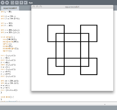
I added in more variables rather than digits. I also changed the background to white because our display boards are black and I wanted my designs to stand out on the black.


Code + 25 Iterations

Code...


25 Final Iterations


I made around 50 iterations and these 25 iterations best showed the process of changes that developed through out changing the variables. I mainly played around with the width and height as those gave the best iterations that was still symmetrical as I wanted to develop the essence of shape. I also used the stoke feature as it gave me quite interesting perspectives to the shape, it changed the way you would perceive the shape. I worked in both positive and negative digits to maximize the possibilities that could come out of my shape. Overall I am happy with what I achieved with my shape. I found it fun experimenting with all  the different possibilities even though I struggled a lot with trying to center my shape when I changed the variables, but I finally found a way that worked for me in the end.

Conceptual Thinking

Conceptual Ideas and Experimenting


First Go...

I made 3 ellipses overlapping each other. However when I tried changing the variables in order to get different iterations of this it did not work the way I wanted it to.


New inspiration:

http://www.openprocessing.org/sketch/66040
I turned my inspiration into more that of a rectangular concept rather than curvilinear forms.

Second Go...


This time it worked better, but I still did not get the result that I wanted. So I continued trying.


New Concept (Final Concept):

First Code for Image. It was very long. It was mainly made out of lines.

Looking at Simple Forms

Simple Forms and their Attributes + Variables


Starting to write coding...


Entering in the co-ordinates (variables) for a shape through drawing lines.