Pages

Friday, October 19, 2012

Interaction - Creative Coding 142

Final...

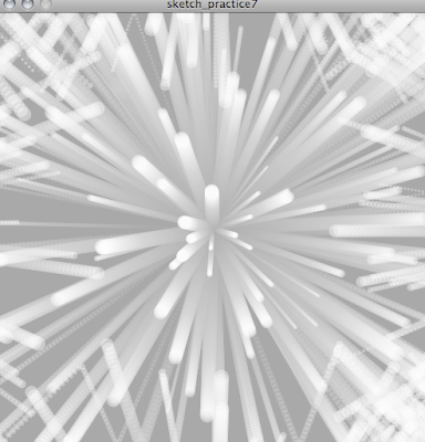
Just a compilation of what my interaction can do.
My final interaction uses the mouse to create different aesthetic kinetic images.
This interaction I explored the difference between control and interaction. My design does include some control after you have discovered all the various interactions that the mouse can provide, but there are endless variation that be created thus only making it partial control. And once you click the mouse buttons and the particles start to act uncontrollably makes for a fun and unexpected experience.
This is my final and its called THE BIG BANG!!!

Interaction - Creative Coding 142

Development Continued...

Presentation 2.0:


Depending on what end of the scene you are the size of the circles change. These images are ordered from the left to the right side of the scene. This change of sizing weirdly reminded me of like particles floating around in a nucleus or something along those lines.


Going back to idea of comets which relates to space I thought of stars and many other things to do with space and one of those things were a supernova and supernovas includes particles that float around. Thus the blue and red represent different particles. The blue also represent the icy coldness of a supernova and the red the fiery heat of a supernova.


I also decided to add in another feature that the particles tail (speed) changes depending on whether you  are at the top or bottom of the scene are.

Thursday, October 18, 2012

Interaction - Creative Coding 142

Development...

Presentation:

Changed the code so that the creatures has a tail. I also changed the creatures to different sizes as not all creatures are the exact same size. And changed the background to black as to represent space as I found that the tail made the creatures look like comets.

Colours:
When the scene is clicked the creatures/comets would become angry/misbehave. I found that the these warm colours illustrated the heat of comets.


Experimented with the background colour just to see what it would look like to have it a lighter colour.
It looked alright, but when I clicked the colour just didn't match. So I scratched this idea.

I then experimented with the keyboard keys so that when you click any key the comets would appear instead of clicking. I also changed the expressive colour to just red so that I didn't have a whole pallet of colours.

I change the command back to clicking as I thought it gave a more aesthetically pleasing image.


I decided that my interaction needed more commands so I added in keyboard commands so that when you press the arrow keys the comets would move up, down, left and right. And you could always move it back as the comets don't disappear but only disappear from the scene.

Wednesday, October 10, 2012

Interaction - Creative Coding 142

Inspiration...

Creatures:


To continue on the circular shape into a sea creature I thought of puffer fish. They are sensitive creatures that are easily frightened and works into my interaction that when the scene is clicked on all creatures become angry or in this case frightened...


Friday, October 5, 2012

Interaction - Creative Coding 142

A Work in Progress Continued...

Bubbles/Creatures:

Improved code of my floating bubbles.


I changed the background colour to blue to simulate the blue sky. Then I thought that the blue could also simulate water and that the bubbles were a creature rather than a bubble. I added in a sort of vibration function so that when you click on the scene all creatures would vibrate and change to red as if they are angry.

Interaction - Interactive Design 112

X Marks the Spot...

Compilation of 5 Screen Shot:

The first shot I included was because I thats how the application begins as each user would have different timetables, routes and favourites. Also to show that you are able to use a touch keypad that pops up.
The second shot is important due to it being the main menu home page. It includes the interfaces different options to maximise user satisfaction.
The third shot spans from the Destination Locator where the pin point option is chosen to choose where you are on campus.
The fourth shot also spans from the Destination Locator where you choose the timetable icon to select a class that you have to go to.
The fifth shot show what else is in the Destination Locator menu bar and also shows how the map looks with the directions indicated on it.

200 Words:


I made my interface application simplistic and easy to navigate around with, only displaying the basics and hiding more options in a menu bar at the top of the screen that comes down when you tap the screen.  The extra option in the menu bar are: a home button which takes you back to the menu screen, forward and back buttons, a tracking system which you turn on to see the path needed and tracks new paths and records them in favourites, the favourites shows previous paths recorded and favourite colour themes and favourite cafés, there is also an apple that represents cafés and areas where there is food drink in general, there is also a toilet button that will locate the toilets on the floor that you are one, customization option where you can select a combination of three colours to keep the application simple and lastly a friends button that will drop down with a list of all your friends and will show whether they are on campus with a green tick by their name. For my application I wanted to concentrate on the purpose of our project that is to get around Kelburn Campus from A to B. I used green, black and white as the default colour combination as it is bold and contrasting to the black. Other colour combinations with black and white are light blue, red and yellow. However you can make your own combinations in the customise section in the menu. There is also a settings section and timetable section.

Interaction - Interactive Design 112

Mapping...

3D:

I wanted to make a sort of 3D map where all 3 levels of the Murphy Building and the 2 levels of the Kirk Building are illustrated to show where you have to go. I make played around with the perspective tool on photoshop and did many different sizes and variations but none of them looked right to me so discarded the idea of the 3D level idea.

Birds Eye View:


So instead I changed my idea to only do the birds eye view of the floor plans of the 2 different buildings. I looks better this way and would be way easier to follow. I got the floor plans off from the SOD sight under our class details and just traced the outlines of the buildings and rooms. And I made small gaps where the lines go through to indicate doors.